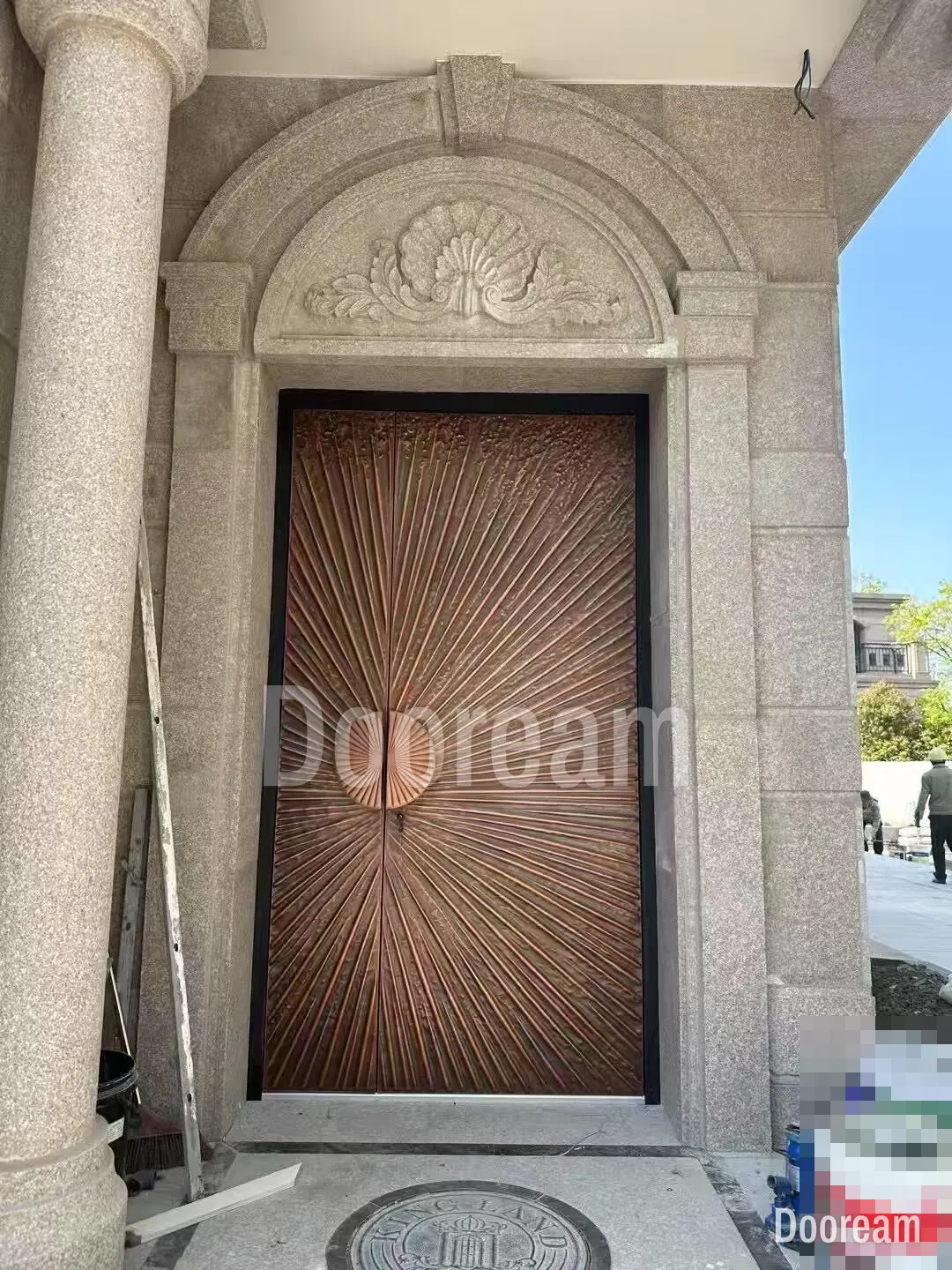
Short answer: choose the door colour against the façade’s main material and the light the entrance gets, not from a chart. Dark colours give a strong silhouette but run hot in sun; light and metallic colours show carved relief through shadow. Then fix the colour as a RAL or NCS code with a gloss level, and approve a physical sample outdoors, next to the real façade.
What colour should a luxury villa’s front door be?
There is no single best colour. The right one contrasts with, or deliberately matches, the façade’s main material, copes with the sun the door gets, and shows the relief if the face has any. Dark bronze-coloured, black and deep brown doors suit pale stone and render; wood tones and light metallics suit dark stone and cladding.
From the gate people see colour and outline; texture and small accents show only within a few metres.
| Façade | Door colours that usually work | Watch out for |
|---|---|---|
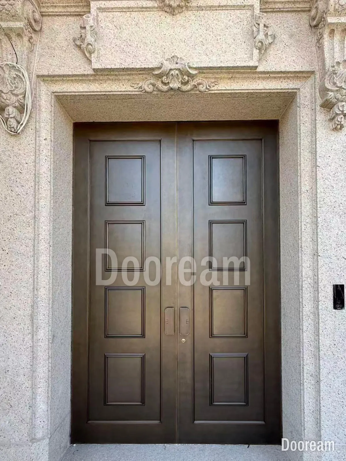
| Pale limestone or granite, classical surrounds | Dark bronze-coloured, deep brown, copper- or gold-coloured; white or ivory with gold-coloured mouldings for a French classical look | A pale door vanishes into pale stone without a dark frame or reveal |
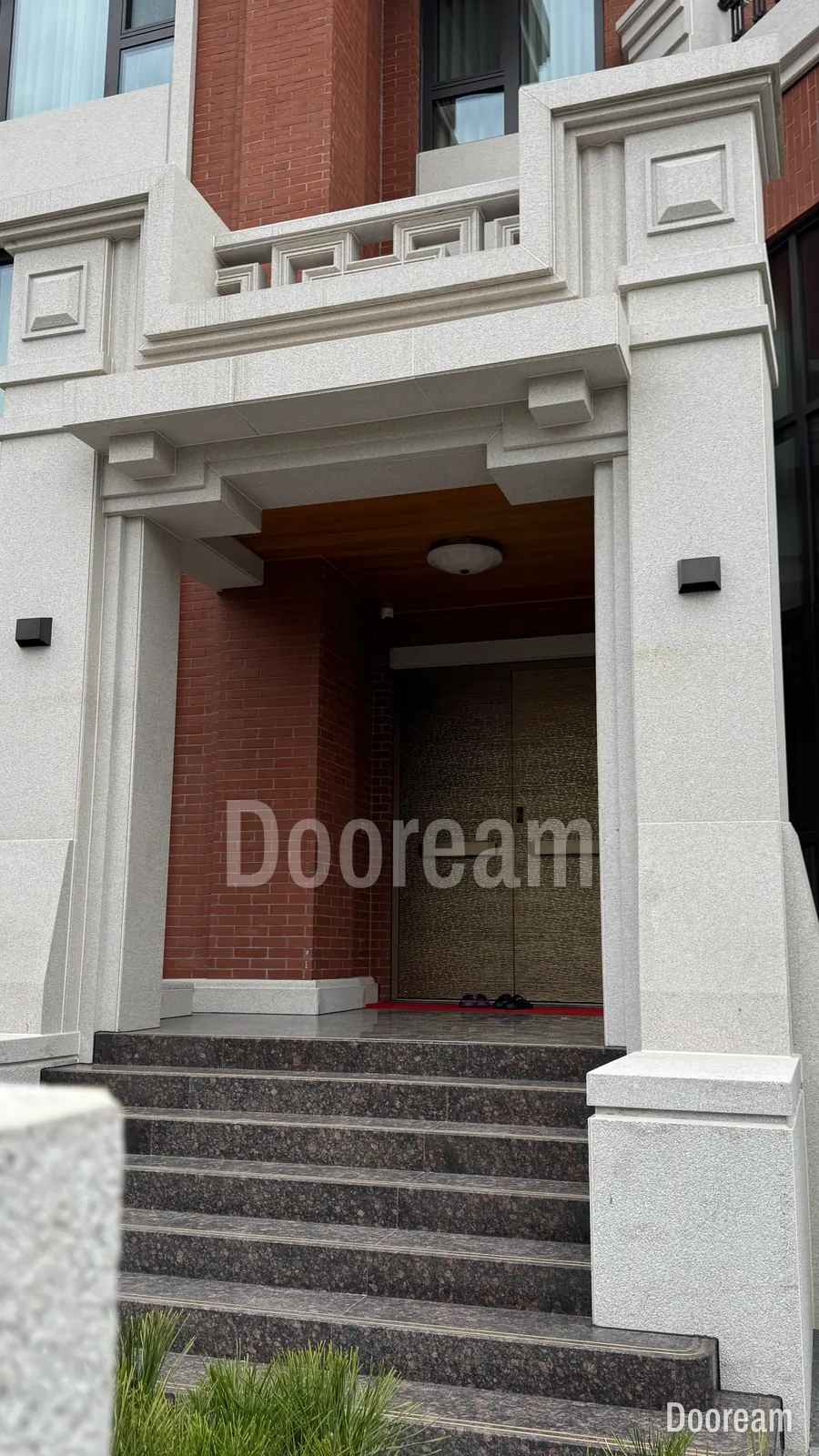
| Red or brown brick | Gold- or bronze-coloured, black, deep green | Reds that fight the brick |
| White or pale render, modern | Black, anthracite, one strong colour such as wine red or ochre, wood tones | Dark faces in full sun need shade |
| Dark stone or dark cladding | Wood tones, copper- or bronze-coloured, light champagne | Black on black loses the outline |
| Timber cladding or soffit | A wood tone matched to the timber, or dark grey against it | Approve it beside the real timber |
| Large glazing with dark frames | The frame colour, or one metallic accent | Match sheen as well as colour |
| Courtyard villa with carved screens | Bronze- or gold-coloured, two-tone relief | See our Islamic geometric patterns guide |
Are dark front doors a problem in strong sun?
They can be, because dark colours absorb more sunlight and run much hotter. In a Xiamen case study cited in the IEA Annex 80 review of cool envelope materials, a black roof with a solar reflectance of 0.05 peaked at 68.6 °C. A white roof (0.79) peaked 27 °C lower and a yellow one (0.57) 20 °C lower.
A door gets less midday sun than a roof, but the physics is the same. In the standard solar spectrum used to rate roofs, 48.7% of the energy is invisible near-infrared. “Cool” pigments reflect more of it, so a dark colour made with them runs cooler than a conventional look-alike; ask for its measured solar reflectance.
A Glass Times article on entrance doors, with comment from Deceuninck Aluminium, notes that sun on a dark-coloured door can make its outside much warmer, and that some installers in the UK advise against dark colours on south-facing doors. A hot outer face over an air-conditioned hall makes the leaf try to bow. For black in full sun, add a canopy or recess and ask how the leaf stays flat; see entrance doors for hot climates and tall doors, bowing and warping. For salt and UV fading, see coastal and high-sun finishes.
Which colours show carved or cast relief best?
Light and mid colours, because relief reads by shadow and a shadow shows clearly on a pale face. On black or dark bronze-coloured faces, shadow and colour are almost the same, so the relief shows only where light catches an edge. From the street, a dark relief door reads as one silhouette.
- Light and mid tones (ivory, champagne, light bronze-coloured, warm grey): every ridge reads, even under a canopy, but dust in the recesses shows first.
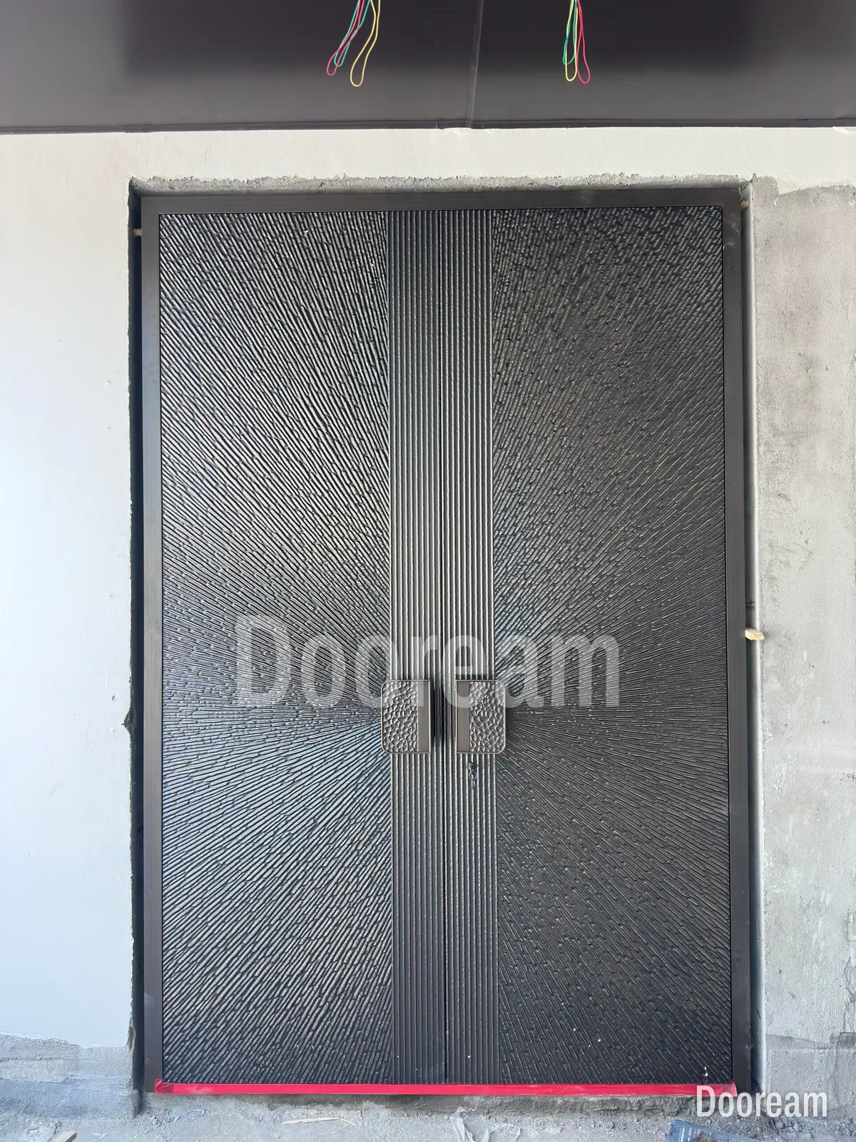
- Dark tones (black, anthracite, dark bronze-coloured): choose them for outline and proportion; bold, deep relief survives, fine texture is lost beyond a few metres. Lattice, a dark bronze-coloured cast relief, reads where its facets catch the light.
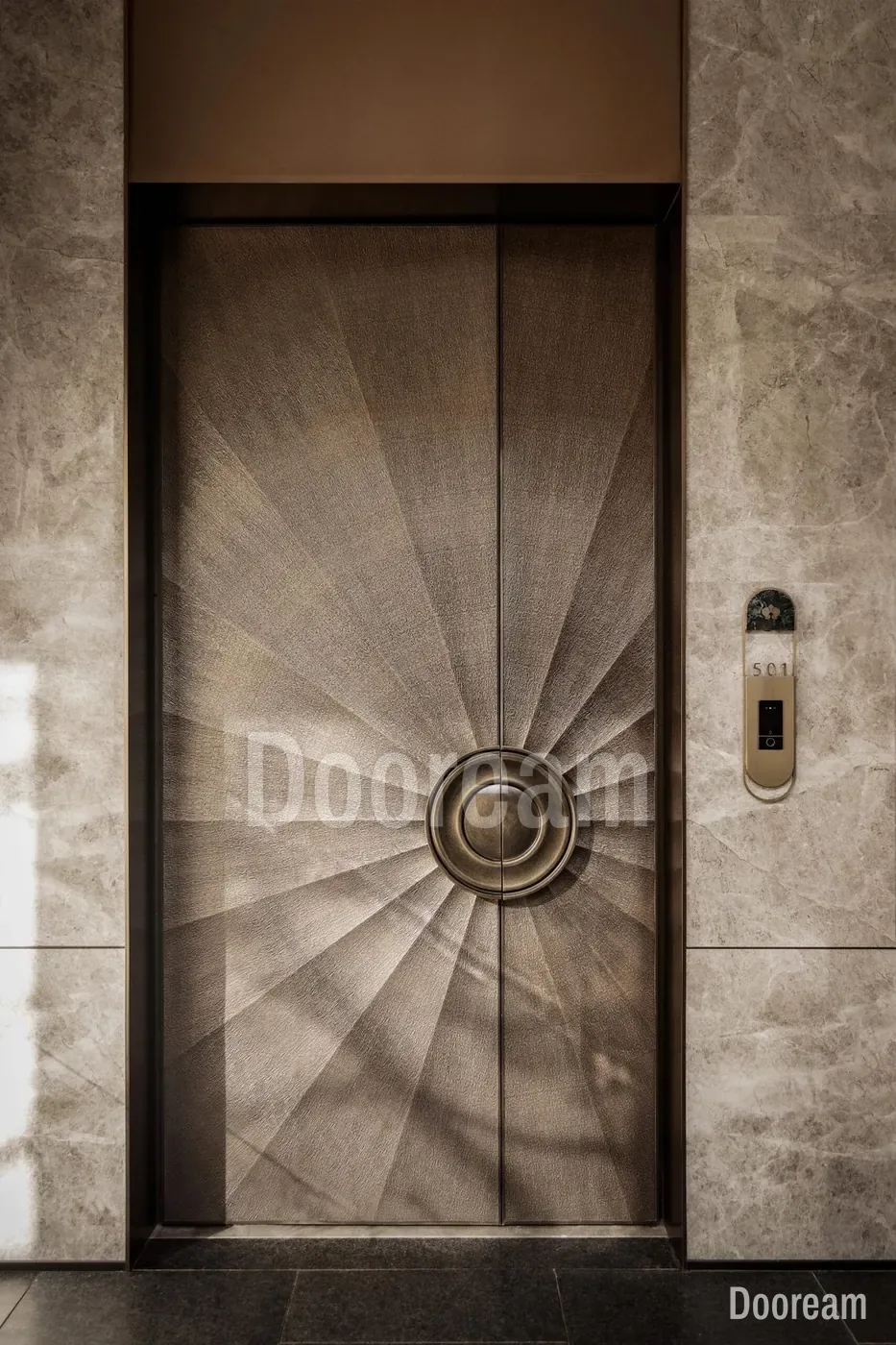
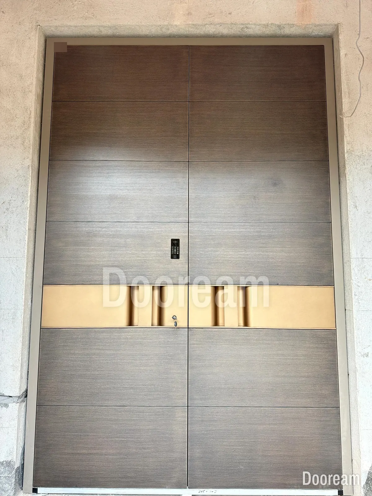
- Metallic and two-tone: a lighter tone on the high points and a darker ground make relief read in almost any light.
- Gold- and bronze-coloured accents: keep them to one element (a band, pull or medallion) that marks where the hand goes. Malachite puts one green stone-pattern pull on a matt black face; white with gold works when the gold stays on a few lines.
- Patina effects: worked in by hand, so the tone varies a little across a leaf. Approve one on a sample; on aluminium it will not darken with age like real bronze (see bronze or cast aluminium).
Matt, satin, gloss, textured or metallic: what does each show?
The lower the gloss, the less a finish shows ripples, glare and hand marks; the higher, the richer the colour and the more it shows every flaw. The Qualicoat specifications for coatings on aluminium set three gloss categories, measured to ISO 2813 with light at 60°, each with a tolerance.
| Qualicoat category | Gloss units | Allowed variation | On a front door |
|---|---|---|---|
| 1, matt | 0–30 | ±5 | Hides glare and handling marks |
| 2, satin | 31–70 | ±7 | Some sheen; in dark colours, shows fingerprints |
| 3, gloss | 71–100 | ±10 | Richest colour; mirrors lights, ripples and marks |
Texture. TIGER Coatings says texture masks small imperfections in the metal that a smooth finish tends to highlight. Parkwood Doors, an aluminium door maker, says gloss and satin, especially in dark colours, highlight fingerprints, while textures hide scratches and scuffs better than any smooth finish. The cost is dirt in the texture; see cleaning an aluminium front door.
Metallic. SAF, a US aluminium finisher, says metallic colour changes with viewing angle because of the flop of the metal flakes, and can differ even within one batch. It asks for production samples approved in writing, and suggests mica coatings where uniformity is a must. On a double door, have both leaves, the frame and any matching panels finished together.
How do you specify a door colour: RAL, RAL Design or NCS?
Use a code, not a name. Give the colour system and the full code for each surface: outside face, inside face, frame, edges and any second tone. Add the gloss category and texture, because a colour code fixes the colour, not the sheen. A photo shows the intent, never the exact colour.
| System | What it is | Example code |
|---|---|---|
| RAL Classic | 216 shades; four-digit numbers, the first digit the group (7 greys, 8 browns, 9 whites and blacks) | RAL + four digits |
| RAL Design System plus | 1,825 shades built on the CIELAB system: hue, lightness, chroma | RAL 270 30 20 |
| RAL Effect | 490 shades, 70 of them metallic | From the RAL Effect chart |
| NCS | Blackness, chromaticness and hue | NCS S 1040-R20B: 10% blackness, 40% chromaticness, red with 20% blue |
Why screens and printed charts mislead. RAL says its colour charts are not binding and four-colour prints do not reproduce all RAL shades true; its binding templates are the RAL 840-HR and 841-GL registers. AkzoNobel’s Interpon cards call printed colours indicative only, and a screen adds its own brightness and settings. Two finishes can also match in one light but not another (metamerism, in X-Rite’s terms), and a metallic changes with viewing angle. So ISO 3668 compares paint colours in a booth under controlled light, such as a D65 daylight simulator, not in variable daylight.
Ask for a physical sample in the real finish, on the real face. Compare it with the reference under steady light, then outdoors beside the façade material, morning and afternoon. Qualicoat judges appearance at about 60° from 3 m, and outdoor parts on site from 5 m, so judge from there, not at arm’s length.
How do you choose and approve a door colour?
Choose from the building and its light, not from a chart, then fix the decision in writing. These ten steps take a colour from first idea to a signed sample that the factory must match on the finished door.
- Photograph the façade when guests arrive; note its main material and colour.
- Note the sun: orientation, hours of direct sun, canopy or recess depth.
- Split the distances: what reads from the gate (colour, outline) and up close (relief, accent).
- Choose the base colour; if dark and sunlit, ask for cool pigments and the solar reflectance, or add shade.
- Choose the relief colouring: one tone, two tones, metallic or a patina effect.
- Choose gloss and texture with cleaning and fingerprints in mind.
- Write each surface as system plus code, inside face and frame included; see our submittal checklist.
- Get a physical sample of the real face and finish; judge it outdoors beside the façade material, from 3–5 m.
- Sign and date the approved sample and note its reference on the drawing.
- Keep the sample to check the delivered door and any later touch-up.
How does this work with Dooream?
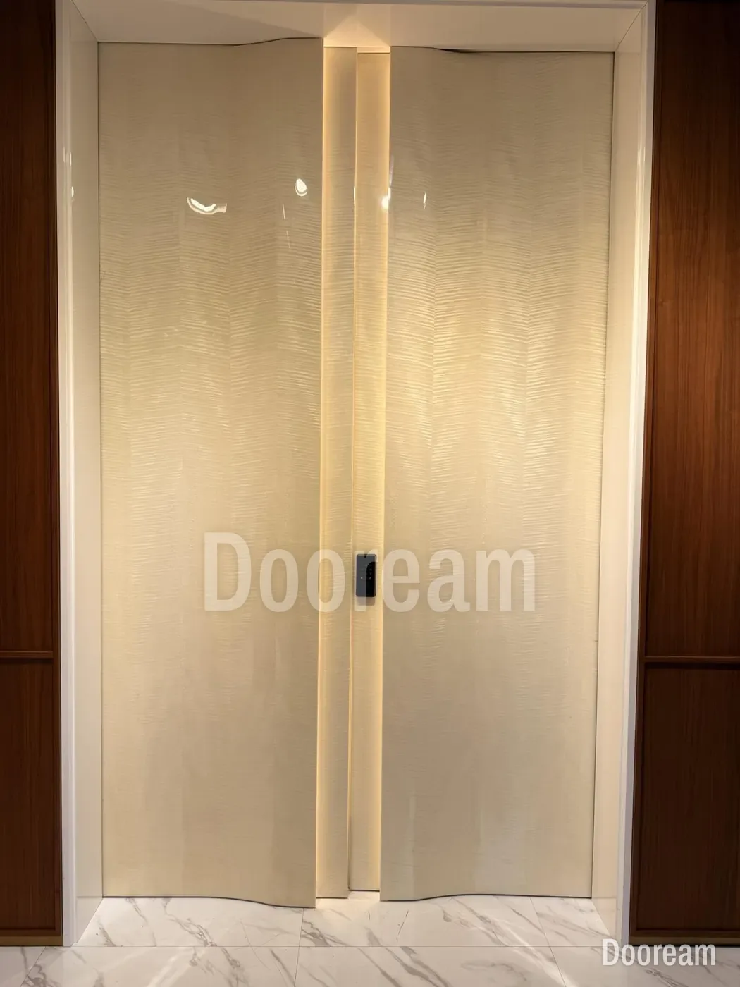
Most of our doors are finished in fluorocarbon (PVDF) paint, such as the dark bronze-coloured Lattice and the black Black Warrior. Others use brushed metallic paint (Sunburst, Sail), piano lacquer (Ivory Wave) or a 5D wood-grain print (Grain Band). Send the opening size, a façade photo and your colour reference through our architects page or contact page; the first design direction is free, usually within one working day. Before production we can make a 20 × 20 cm carved and painted aluminium sample, a scaled sample door with the real construction, or a full-size one. Production takes 35–45 days after drawing approval and deposit.
Sources, checked November 2026: M. Kolokotroni, R. Levinson et al., IEA EBC Annex 80, state-of-the-art review, section 4.2, cool envelope materials (pre-print, 2021); Glass Times, how do you achieve a perfectly fitting entrance door (March 2022); QUALICOAT, Specifications 2024, sections 2.1 and 2.2; TIGER Coatings, textured powder coatings in architectural applications; Parkwood Doors, matt or textured powder coat for aluminium front doors (August 2026); SAF, metallic paint colour variation; RAL, FAQ and FAQ on RAL colour charts and codes; NCS, the NCS system; AkzoNobel, Interpon D Textura colour card (issue 2, 2023); X-Rite, geometric metamerism; ISO 3668:2017, visual comparison of colour of paints.
Quick answers
What colour should a luxury villa's front door be?
There is no single best colour. Choose it against the façade's main material and the light the door gets. Dark bronze-coloured, black and deep brown doors read strongly against pale stone or render; wood tones and light metallics suit dark stone and cladding; gold- and bronze-coloured accents suit classical façades. In strong sun, choose a lighter or cool-pigment colour, or shade a dark door.
Is a dark front door a problem in a hot climate?
It can be. Dark colours absorb more sunlight. In a Xiamen case study cited in the IEA Annex 80 review of cool envelope materials, a black roof with a solar reflectance of 0.05 peaked at 68.6 °C, while white and yellow roofs peaked 27 °C and 20 °C lower. On a metal door the hot outer face can make the leaf bow, so shade a dark door, ask for cool pigments or choose a lighter colour.
How do I specify a door colour so it comes out as approved?
Give the colour system and the full code for each surface, such as a four-digit RAL Classic number, a RAL Design code like RAL 270 30 20 or an NCS code like S 1040-R20B, and add the gloss level and texture. Then approve a physical sample outdoors, beside the real façade. RAL itself says printed colour charts are not binding.